Chapter 4 notes
Why things are normal
Let’s simulate an experiment. Let’s suppose 1,000 people flip a coin 16 times. What we see is that any process that adds together random values from the same distribution converges to a normal distribution. There are multiple ways to conceptualize why this happens, one, is becuase when we have extreme fluctuations, the more we sample, the more they tend to cancel each other out. A large positive fluctuation will cancel out a large negative one. Also from a combinatorical perspective there are more paths (or possible outcomes) that sum to 0 than say 10, but in general, the most likely sum is the one where all the fluctuations cancel each another out, leading to a sum of 0 relative to the mean.
pos <- replicate(1000, sum(runif(16, -1, 1)))
dens(pos, norm.comp = TRUE, col = "blue", main = "Results of 1,000 people flipping a coin 16 times")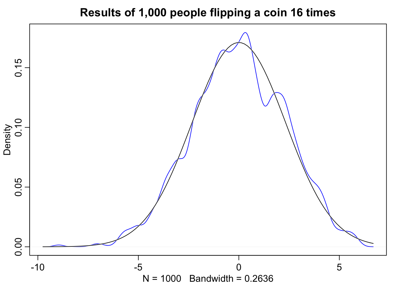
Normality also occurs when we multiply, however this only works when the products are sufficiently small. For example let’s look at 12 loci that interact with one another to increase growth rates in organisms by some percentage. The reason this approaches normality is because the product of small numbers very closely approximated by their sum. Take for example, \(1.1 * 1.1 = 1.21\) this is nearly equivalent to \(1.1 + 1.1 = 1.2\). The smaller the effect of each locus, the better this sum approximation will be.
# prod(1 + runif(12, 0, 0.1))
growth <- replicate(1000, prod(1 + runif(12, 0.0, 0.1)))

# sample where the growth rate has a larger effect
growth.big <- replicate(1000, prod(1 + runif(12, 0.0, 0.5)))

# norm.comp = TRUE overlays the normal distribution
dens(growth, norm.comp = TRUE, col = "blue", main = "Small growth, between 0.0 and 0.1")
dens(growth.big, norm.comp = TRUE, col = "blue", main = "Large growth, between 0.0 and 0.5")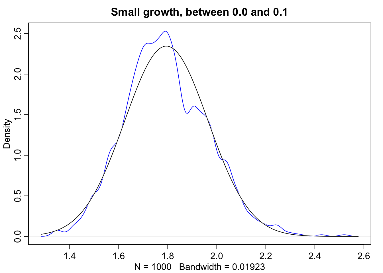
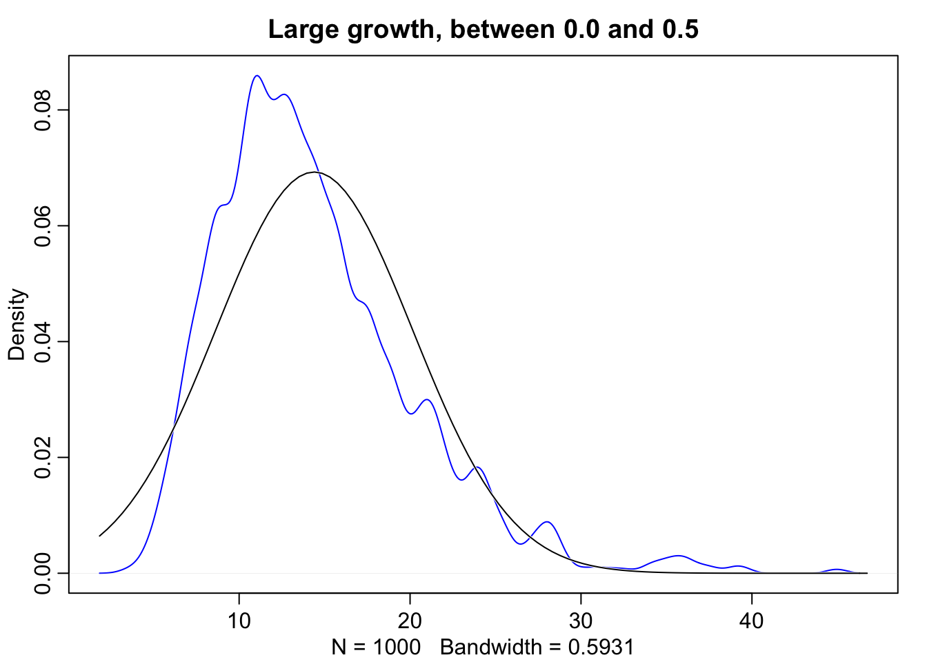
Even though large deviates multiplied together don’t produce Gaussian distributions, on a log scale they do.
log.big <- replicate(1000, log(prod(1 + runif(12, 0.0, 0.5))))
dens(log.big, norm.comp = TRUE, col = "blue", main = "Large growth on log scale")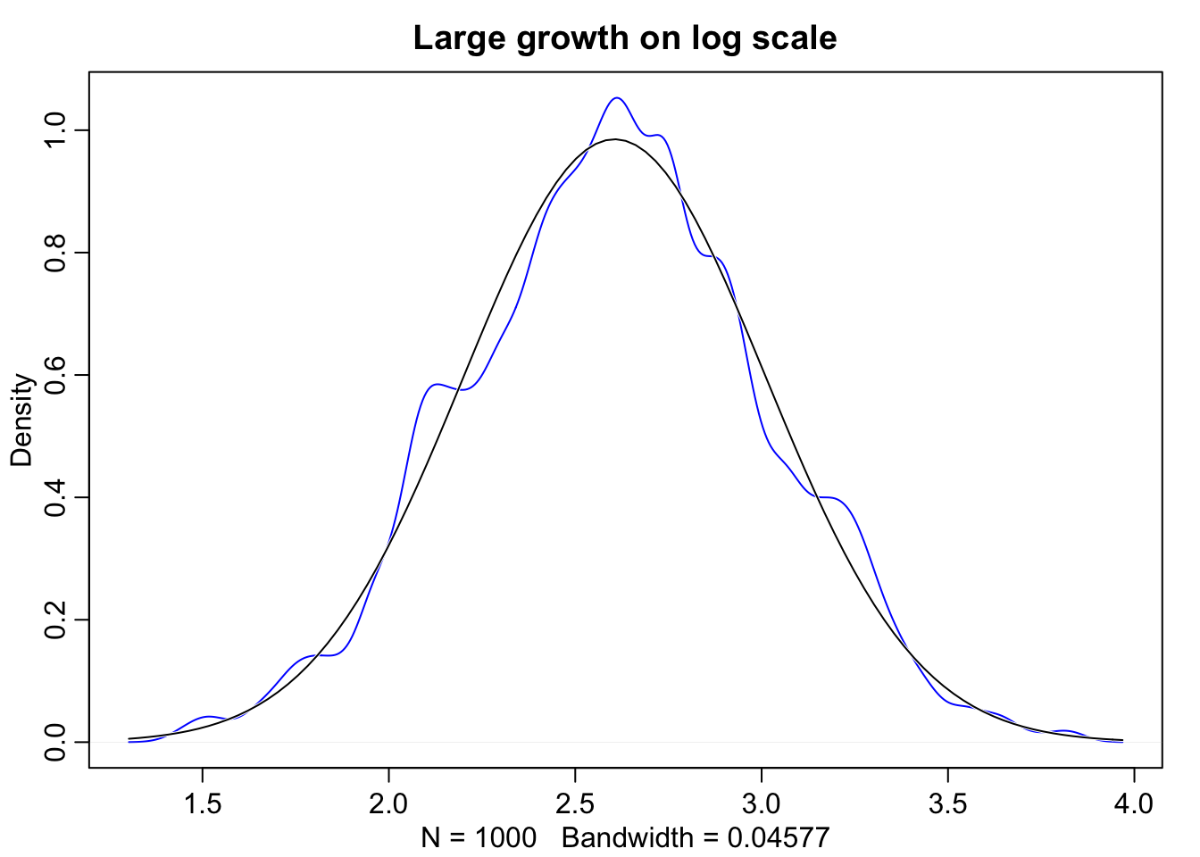
A quick note on notation: The Gaussian is a continuous distribution whereas the binomial is discrete. Probability distributions with only discrete outcomes, like the binomial, are usually called probability mass functions and are denoted \(Pr()\). Continuous ones, like the Gaussian, are called probability densisty functions, denoted \(p()\).
Linear Regression
Let’s revisit the globe tossing model.
\[w \sim Binomial(N,p) \\ p \sim Uniform(0,1)\]
Interpretation: We say the outcome, \(w\) is distributed binomially with \(N\) trials, each one having chance \(p\) of success. And the prior \(p\) is distributed uniformly with mean 0 and standard deviation 1. It’s important to recognize that the binomial is the distribution of the data and the uniform is the distribution of the prior. This should make sense, in the previous homeworks we were constantly putting equal weight for all the prior values.
Now let’s look at the variables of a linear regression model. \[ \begin{array}{l} y_{i} \sim Normal(\mu_{i}, \sigma) \\ \mu_{i} = \beta x_{i} \\ \beta \sim Normal(0,10) \\ \sigma \sim Exponential(1) \\ x_{i} \sim Normal(0,1) \end{array} \]
We’ll keep this in mind and expand upon it later as we look through an example of height data of Kalahari foragers collected by Nancy Howell. We’re goin go focus on adult heights and we’re going to build a model to describe the gaussian distribution of these heights.
data("Howell1")
d <- Howell1

# look at adults over the age of 18
d %<>%
  subset(age > 18)
precis(d)
## mean sd 5.5% 94.5% histogram
## height 154.6443688 7.7735641 142.87500 167.00500 ▁▃▇▇▅▇▂▁▁
## weight 45.0455429 6.4552197 35.28946 55.79536 ▁▅▇▇▃▂▁
## age 41.5397399 15.8093044 21.00000 70.02500 ▂▅▇▅▃▇▃▃▂▂▂▁▁▁▁
## male 0.4739884 0.5000461 0.00000 1.00000 ▇▁▁▁▁▁▁▁▁▇dens(d$height, norm.comp = TRUE, col = "blue")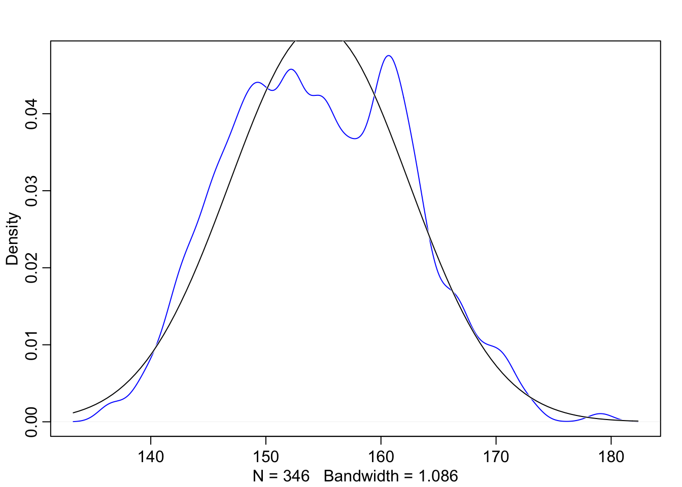
Looking at the outcome data, we can see that it resembles a Gaussian distribution, so we can assume that the model’s likelihood should be Gaussian too. In this example we’re going to statrt by saying an individual’s height \(h_{i}\) is distributed normally with mean \(\mu\) and standard deviation \(\sigma\).
\[h_{i} \sim Normal(\mu, \sigma)\]
Now \(\mu\) and \(\sigma\) have not been observed, we need to infer them from what we have measured, which in this case is \(h\). But we still need to define them, and these are going to act as our priors.
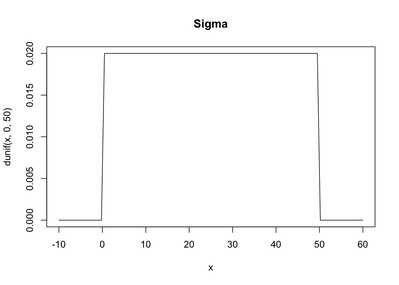
\[ \mu \sim Normal(178, 20) \\ \sigma \sim Uniform(0, 50) \]
Above we’re defining \(\mu\) as being normally distributed around 178 centimeters with a standard deviation of 20. We started with 178 as the mean height because that’s the height of Richard McElreath. This is a broad assumption, it means that 95% probability is between \(178\pm 40\) and while this might not be the best choice for a prior it’s good enough for now. For \(\sigma\) we’re saying that it is uniformly distributed from 0 to 50. We know it needs to be positive so bounding it at 0 makes sense, as for the upper bound, choosing a standard deviation of 50cm implies that 95% of individuals lie within 100cm of the average height.
Whatever your priors are, it’s always a good idea to plot them. This will give you a chance to see what assumptions your priors are building into the model.
curve(dnorm(x, 178, 20), from = 100, to = 250, main = "Mu")
curve(dunif(x, 0, 50), from = -10, to = 60, main = "Sigma")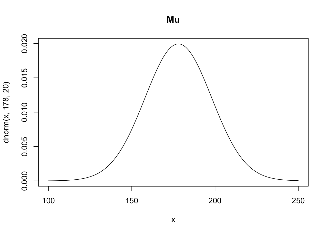
Prior predictive distribution
Now we can use these priors and simulate before actually seeing the data. This is very powerful, it’s allowing us to see what our model believes before we feed it the data. We’re going to try and build good priors before seeing the data. Note that this is not p-hacking because we’re not using the data to educate the model.
Now to run this simulation all you need to do is sample values from the variables
sample_mu <- rnorm(1e4, 178, 20)
sample_sigma <- runif(1e4, 0, 50)
prior_h <- rnorm(1e4, sample_mu, sample_sigma)
dens(prior_h, norm.comp = TRUE, col = "red")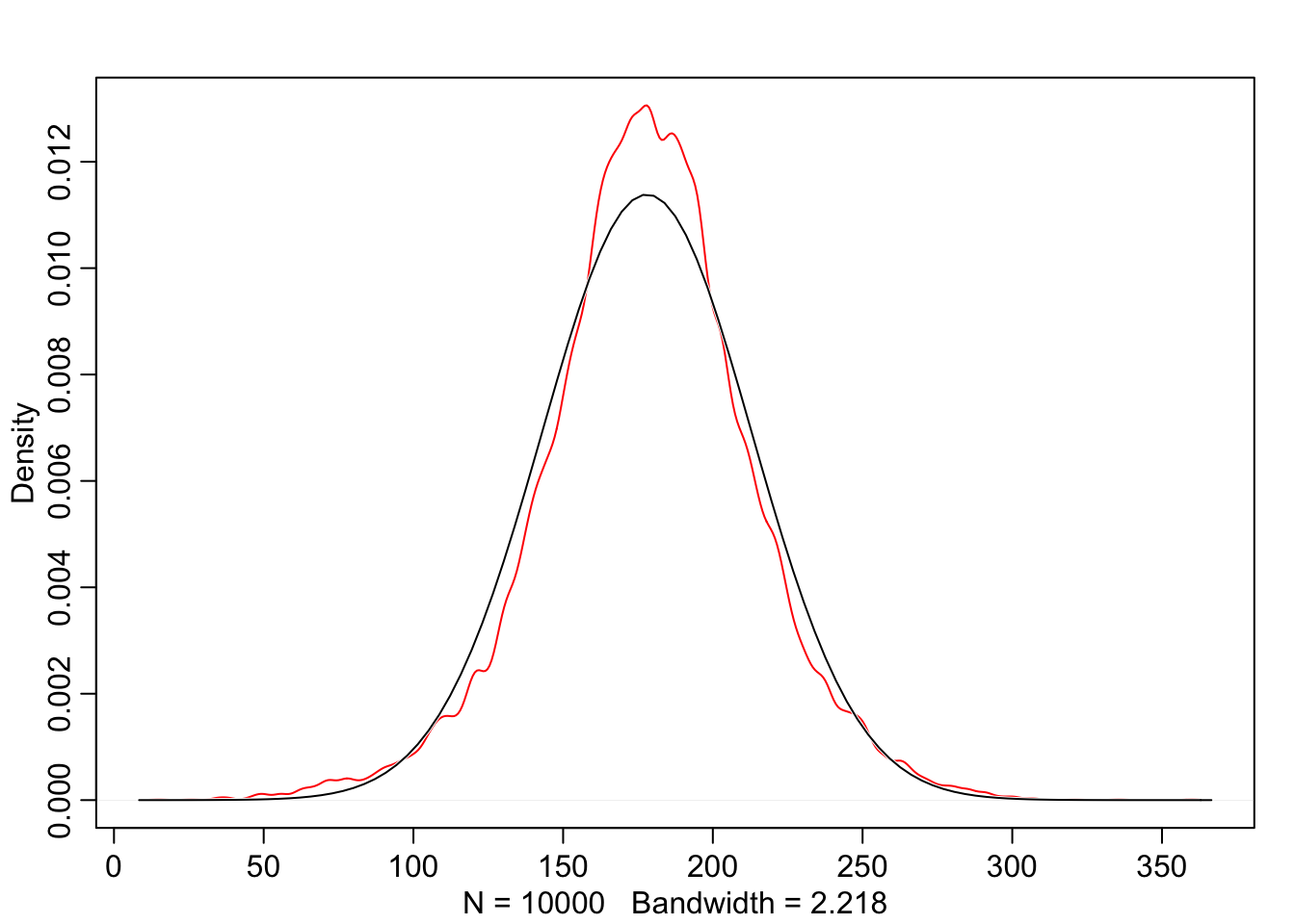
Looking at this we can see that the distribution is not quite normal, it’s actually a T distribution. There’s uncertainty about the standard deviation, which is why we see these fat tails. These might not be the best priors in the world but at least we’re in the realm of possibility.’’
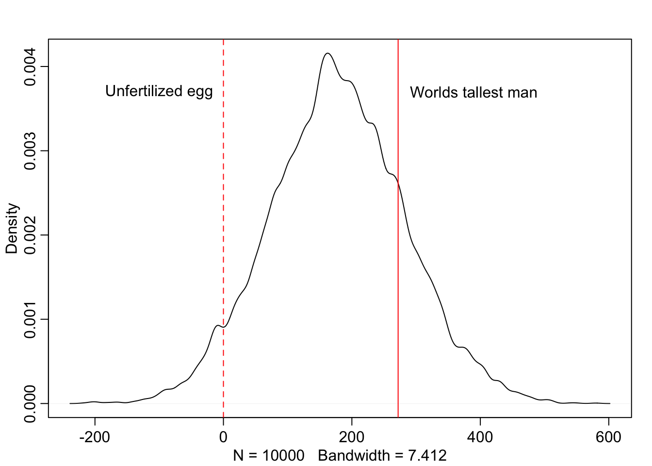
Below we’ll consider the same example but with \(\mu\) having a standard deviation of 100. Now we can see that this distribution includes some pretty unrealistic possibilities. Like humans smaller than an unfertilized egg, and a large number of people taller than the tallest recorded man in history. We don’t need to have seen the data beforehand to know that we can do better than this distribution.
Grid approximation of the posterior distribution
Below we are going to use brute force to map out the posterior distribution. Often times this is an impractical approach as it’s computationally expensive. But it is worth knowing what the target actually looks like, before we start accepting approximations of it. The code below is
# Establish the range of mu and sigma
mu.list <- seq( from=140, to=160 , length.out=200 )
sigma.list <- seq( from=4 , to=9 , length.out=200 )

# Take all possible combinations of mu and sigma
post <- expand.grid( mu=mu.list , sigma=sigma.list )

# Compute the log-likelihood at each combination of mu and sigma.
post$LL <- sapply( 1:nrow(post) , function(i) sum( dnorm(
                d$height ,
                mean=post$mu[i] ,
                sd=post$sigma[i] ,
                log=TRUE ) ) )

# Multiply the prior by the likelihood. since the priors and likelihood are on the log scale we add them together which is equivalent to multiplying.
post$prod <- post$LL + dnorm( post$mu , 178 , 20 , TRUE ) +
    dunif( post$sigma , 0 , 50 , TRUE )

# Get back to the probability scale from the log scale. We scale all of the log-products by the maximum log-product
post$prob <- exp( post$prod - max(post$prod) )

# Plotting a simple heat map
# image_xyz( post$mu , post$sigma , post$prob )
plot_ly(
  x = post$mu,
  y = post$sigma,
  z = post$prob,
  type = "contour",
  colorscale = list(
    c(0, 0.25, 0.5, 0.75, 1),
    c('black','purple','red','orange','white'))
  )
“Computers are nice, but combinatorics will get you in the end.”
Sampling from the posterior
To study the posterior distribution even more, we’re going to sample parameter values from it. Since there are two parameter values, we will randomly sample row numbers in post, then we pull parameter values from those sampled rows.
sample.rows <- sample(1:nrow(post), size = 1e4, replace = TRUE, prob = post$prob)
sample.mu <- post$mu[sample.rows]
sample.sigma <- post$sigma[sample.rows]
# cex: character expansion, size of the points
# pch: plot character
# col.alpha: transparancy factor
# plot( sample.mu , sample.sigma , cex=0.5 , pch=16, col=col.alpha(rangi2,0.1), main = "Samples from the posterior distribution" )
post[sample.rows, ] %>%
ggplot(aes(x = sample.mu, y = sample.sigma)) +
geom_point(size = 0.9, alpha = 1/15) +
scale_fill_viridis_c() +
labs(x = expression(mu[samples]),
y = expression(sigma[samples])) +
theme(panel.grid = element_blank()) +
ggtitle("Samples from the posterior distribution")
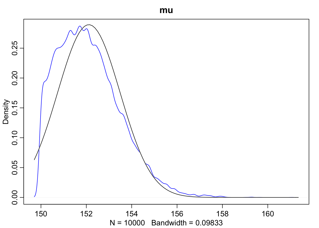
# marginal posterior densities of mu and sigma
dens(sample.mu, main = "mu")
dens(sample.sigma, main = "sigma")
knitr::kable(data.frame("HPDI lower" = c(HPDI(sample.mu)[[1]], HPDI(sample.sigma)[[1]]), "HPDI upper" = c(HPDI(sample.mu)[[2]], HPDI(sample.sigma)[[2]]), row.names = c("sample mu", "sample sigma")))| HPDI.lower | HPDI.upper | |
|---|---|---|
| sample mu | 154.070352 | 155.376884 |
| sample sigma | 7.316583 | 8.246231 |
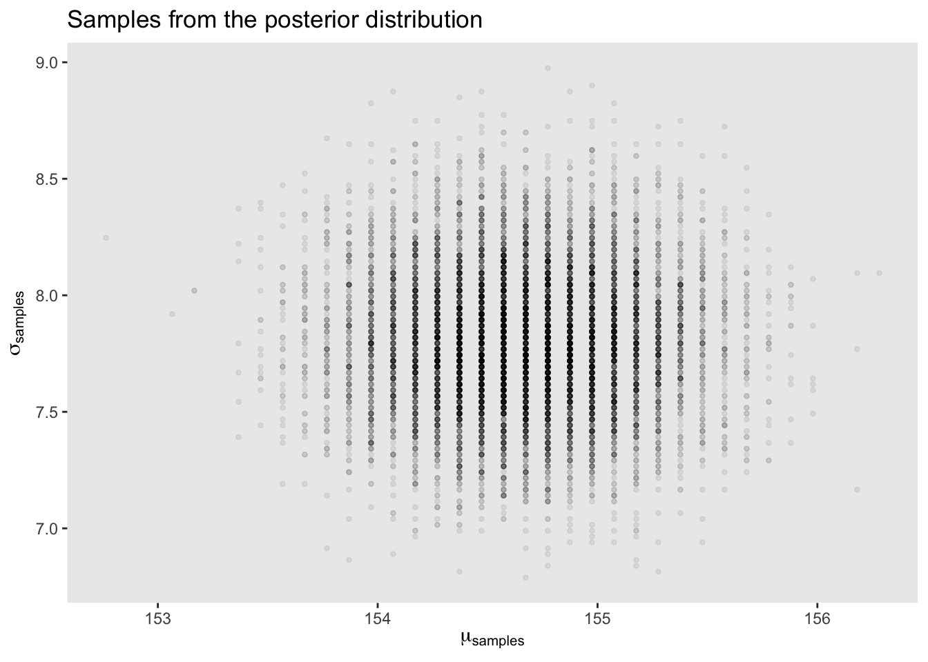
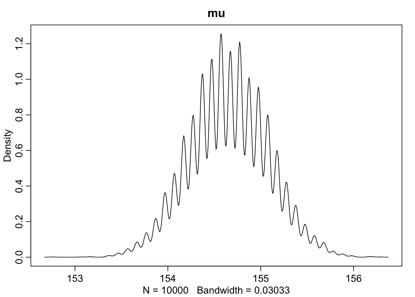
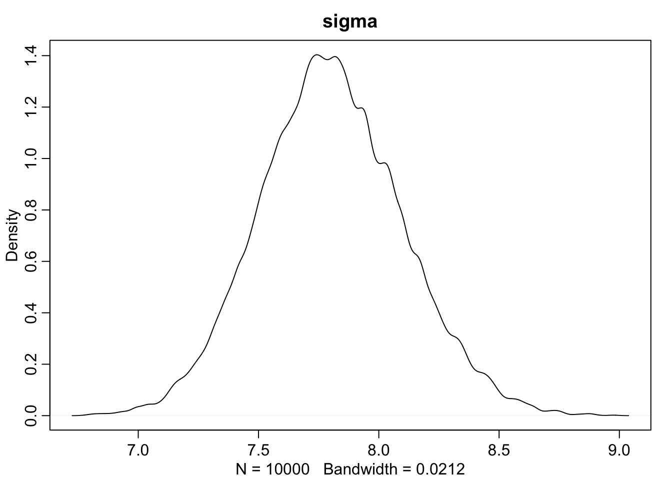
This is very cool. We can compare the HPDI of \(\mu\) and \(\sigma\) to the contour map before and see that is matches up with the outer rings of our map.
It is important to realize that the posterior is not always Gaussian in shape. The mean \(\mu\) is fine, however the standard deviation \(\sigma\) can cause problems. Let’s reduce the sample size down to 20 heights to help visualize issue. The following code is identical to everything above with the exception of d3.
d3 <- sample(d$height, size = 20)

mu.list <- seq( from=150, to=170 , length.out=200 )
sigma.list <- seq( from=4 , to=20 , length.out=200 )
post2 <- expand.grid( mu=mu.list , sigma=sigma.list )
post2$LL <- sapply( 1:nrow(post2) , function(i)
    sum( dnorm( d3 ,
                mean=post2$mu[i] ,
                sd=post2$sigma[i] ,
                log=TRUE ) ) )
post2$prod <- post2$LL + dnorm( post2$mu , 178 , 20 , TRUE ) +
    dunif( post2$sigma , 0 , 50 , TRUE )
post2$prob <- exp( post2$prod - max(post2$prod) )

sample2.rows <- sample( 1:nrow(post2) , size=1e4 , replace=TRUE ,
    prob=post2$prob )
sample2.mu <- post2$mu[ sample2.rows ]
sample2.sigma <- post2$sigma[ sample2.rows ]

# plot( sample2.mu , sample2.sigma , cex=0.5 ,col=col.alpha(rangi2,0.1) ,
#     xlab="mu" , ylab="sigma" , pch=16, main = "Samples from the posterior distribution")

post2[sample2.rows, ] %>%
  ggplot(aes(x = sample2.mu, y = sample2.sigma)) +
  geom_point(size = 0.9, alpha = 1/15) +
  scale_fill_viridis_c() +
  labs(x = expression(mu[samples]),
       y = expression(sigma[samples])) +
  theme(panel.grid = element_blank()) +
  ggtitle("Samples from the posterior distribution")

dens(sample2.mu, norm.comp = TRUE, main = "mu", col = "blue")
dens(sample2.sigma, norm.comp = TRUE, main = "sigma", col = "blue")

# Plotting density using ggplot
# ggplot(mapping = aes(sample2.mu)) +
#   geom_density(aes(y = ..density.., color = "red")) +
#   stat_function(fun = dnorm, args = list(mean = mean(sample2.mu), sd = sd(sample2.mu)), color = "black") +
#   ggtitle("Mu")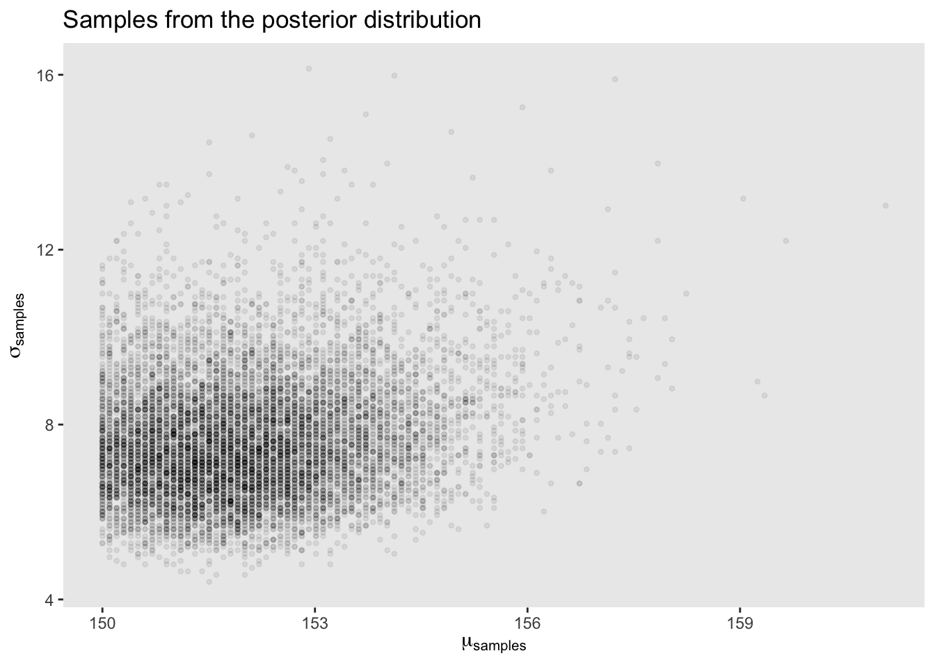
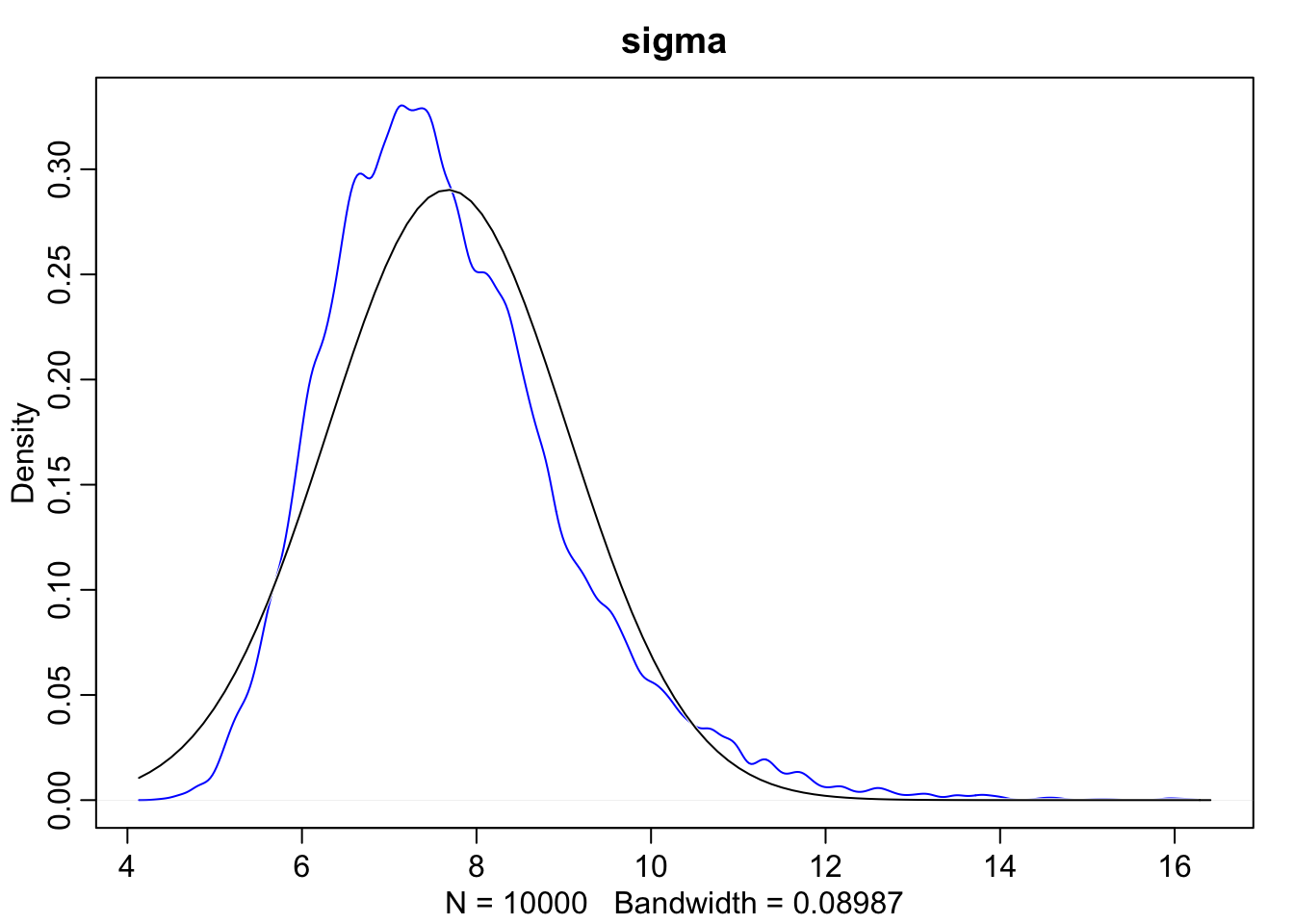
As we can see here, when we look at the scatterplot there’s a much longer tail. Additionally, when we overlay the normal distribution over sigma we can see that the posterior for \(\sigma\) is not Gaussian, but rather has a long tail of uncertainty towards higher values.
While the posterior distribution of \(\sigma\) is often not Gaussian, the distribution of it’s logarithm, \(\text{log(} \sigma \text{)}\) can be much closer. Notice in the code below that we now take the exp(log_sigma) to convert it back from a continuous parameter to one that is strictly positive. Also note that since the prior log_sigma is continous we can now use a Gaussian distribution.
m_logsigma <- quap(
  alist(
  height ~ dnorm(mu, exp(log_sigma)),
  mu ~ dnorm(178, 20),
  log_sigma ~ dnorm(2, 10)
  ), data = d)
When we extract samples it is log_sigma that has the Gaussian distribution so we need to use exp() to get it back to the natural scale.
posterior <- extract.samples(m_logsigma)
sigma <- exp(posterior$log_sigma)
When there’s a lot of data, this won’t make much of a difference. However, to use exp() to constrain a parameter to be positive is a useful tool to have.
Quadratic Approximation
Our interest is to make quick inferences about the shape of the posterior. The posterior’s peak will lie at the maximum a posteriori estimate (MAP). So we want to find values of \(\mu\) and \(\sigma\) that maximize the posterior probability. We’ll begin by reuising the code from earlier, recall.
\[ \begin{array}{ll} h_{i} \sim \text{Normal}(\mu, \sigma) && \text{height ~ dnorm(mu, sigma)} \\ \mu \sim \text{Normal}(178, 20) && \text{mu ~ dnorm(178, 20)} \\ \sigma \sim \text{Uniform}(0, 50) && \text{sigma ~ dunif(0, 50)} \end{array} \]
# Create our formula list
flist <- alist(
  height ~ dnorm(mu, sigma),
  mu ~ dnorm(178, 20),
  sigma ~ dunif(0, 50)
)

# fit the model to the data frame using quadratic approximation, quap, performs maximum a posteriori fitting
m <- quap(flist, d)
precis(m)
## mean sd 5.5% 94.5%
## mu 154.654667 0.4171954 153.987908 155.321426
## sigma 7.761958 0.2950447 7.290419 8.233496The 5.5% and 94.5% are percentile interval boundaries corresponding to an 89% interval. Why 89? Because it’s quite a wide range so it shows a high-probability range of parameter values, 89 is also a prime number. When we compare these values to our grid approximation HPDIs we see that they’re nearly identical. This is what we should expect to see when the posterior distribution is approximately Gaussian.
Now let’s do a fun little example. Let’s change the prior \(\mu\) so that the standard deviation is 0.1.
m2 <- quap(
  alist(
    height ~ dnorm(mu, sigma),
    mu ~ dnorm(178, 0.1),
    sigma ~ dunif(0, 50)
  ),
  data = d)

precis(m2)
## mean sd 5.5% 94.5%
## mu 177.86600 0.1002314 177.70581 178.02619
## sigma 24.48317 0.9354678 22.98811 25.97823What we see here is actually really cool. Since we specified such a small standard deviation for \(\mu\) our model is confident that it must be in a very tight range around 178. This isn’t that surprising, but now take a look at \(\sigma\), our model is compensating for the fact that our \(\mu\) is essentially fixed by drastically changing it’s estimates for \(\sigma\).
Sampling from quadratic approximation
Above we were using quap to get approximations for the posterior, now we will learn how to get samples from the quadratic approximate posterior distribution. For a normal Gaussian distribution, all that we need to describe it is a mean and standard deviation (or it’s square, variance). But each parameter \(\mu\) and \(\sigma\) add a dimension to the distribution. So we just need to add a list of means and a matrix of variances and covariances to describe a multi-dimensional Gaussian distribution.
# Get the variance-covariance matrix
vcov(m)
## mu sigma
## mu 0.1740519793 0.0002308886
## sigma 0.0002308886 0.0870513589# A variance-covariance matrix can be broken into two parts
# (1) a vector of variances for the parameters
diag(vcov(m))## mu sigma
## 0.17405198 0.08705136# (2) A correlation matrix - how changes in one parameter lead to correlated changes in the others.
cov2cor(vcov(m))## mu sigma
## mu 1.000000000 0.001875751
## sigma 0.001875751 1.000000000Now, instead of sampling single values from a simple Gaussian distribution, we sample vectors of values from a multi-dimensional Gaussian distribution. Each value from the resulting data frame below is sampling from the posterior, so the mean and standard deviation of each column will be close to our quap model from before. An important note as well, these samples preserve the covariance between \(\mu\) and \(\sigma\).
post <- extract.samples(m, 1e4)
head(post)
## mu sigma
## 1 154.9656 7.738443
## 2 154.6283 7.376983
## 3 154.3738 7.243852
## 4 155.4022 8.033436
## 5 154.6798 7.707043
## 6 154.4080 7.968199precis(post)## mean sd 5.5% 94.5% histogram
## mu 154.654292 0.4145503 153.986664 155.310835 ▁▁▅▇▃▁▁
## sigma 7.755059 0.2949609 7.284616 8.225917 ▁▁▁▂▅▇▇▃▂▁▁▁Adding a predictor
Let’s look at how the Kalahari foragers height covaries with weight. Below we can clearly see that there is a relationship that should allow us to predict someone’s height based off of weight.
# plot(d$height ~ d$weight)
ggplot(d, aes(x = weight, y = height)) +
  geom_point()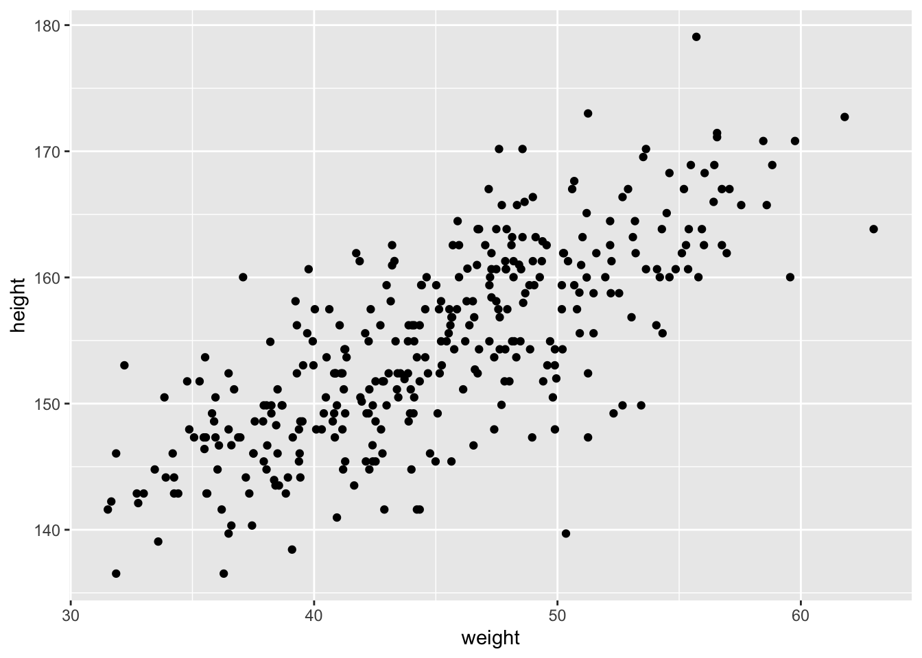
Let’s define our variables as before: \[ \begin{array}{lcr} h_{i} \sim \text{Normal}(\mu_{i}, \sigma) && \text{[likelihood]} \\ \mu_{i} = \alpha + \beta x_{i} && \text{[linear model]} \\ \alpha \sim \text{Normal}(178,100) && [\alpha \text{ prior}] \\ \beta \sim \text{Normal}(0,10) && [\beta \text{ prior}] \\ \sigma \sim \text{Uniform}(0,50) && [\sigma \text{ prior}] \end{array} \]
likelihood: This is nearly identical to our definitions from before, except now we indexed \(\mu\) and \(h\), so they depend on the mean of each row.
linear model: \(\mu\) is now a linear combination of \(\alpha\) and \(\beta\). \(\alpha\) tells us what the expected height is when \(x_{i} = 0\), also known as the intercept. and \(\beta\) is the expected change in height, when \(x_{i}\) changes by 1 unit.
priors: We’ve seen \(\alpha\) and \(\sigma\) before, it’s just that \(\alpha\) was previously called \(\mu\). We also widened the prior for \(\alpha\), having a huge standard deviation will allow it to move wherever it needs to. By having \(\beta\) be Gaussian with mean 0 and standard deviation 10, we end up placing just as much probability below zero as it does above zero, and when \(\beta = 0\), weight has no relationship to height. This is a more conservative estimate than a perfectly flat prior, but it’s still weak, and in this context silly as well because we can see that there’s clearly a positive relation between height and weigh. In this example, choosing our prior as such is harmless because there’s so much data, however, in other contexts we may need to nudge our golem in the right direction.
Fitting the model
\[ \begin{array}{lcr} h_{i} \sim \text{Normal}(\mu_{i}, \sigma) && \text{height } \sim \text{dnorm(mu, sigma)} \\ \mu_{i} = \alpha + \beta x_{i} && \text{mu <- a + b*weight} \\ \alpha \sim \text{Normal}(178,100) && \text{a } \sim \text{dnorm(156, 100)} \\ \beta \sim \text{Normal}(0,10) && \text{b } \sim \text{dnorm(0,10)} \\ \sigma \sim \text{Uniform}(0,50) && \text{sigma } \sim \text{dunif(0,10)} \end{array} \]
# load the data again
data(Howell1)
d <- Howell1 %>%
  subset(age >= 18)

m <- quap(
  alist(
    height ~ dnorm(mu, sigma),
    mu <- alpha + beta*weight,
    alpha ~ dnorm(178, 100),
    beta ~ dnorm(0, 10),
    sigma ~ dunif(0, 50)
  ), data = d)

precis(m)
## mean sd 5.5% 94.5%
## alpha 113.9033846 1.90526771 110.8583988 116.9483704
## beta 0.9045063 0.04192011 0.8375098 0.9715027
## sigma 5.0718673 0.19115325 4.7663675 5.3773671Interpreting the table: Starting with beta, we see the mean is 0.90, this means that a person 1kg heavier is expected to be 0.90 cm taller. Additionally 89% of the posterior probability lies between 0.84 and 0.97. This suggests that \(\beta\) values close to zero or greatly above one are highly incompatible with the data and this model. The estimate of alpha indicates that a person of weight 0 should be 114cm tall. This is nonsense, but it is often the case that the value of the intercept is uninterpretable without also studying any \(\beta\) parameters. Finally, sigma informs us of the width of the distribution of heights around the mean. Recall that 95% of the probability in a Gaussian distribution lies between two standard deviations. So we can say that 95% of plausible heights lie within 10cm of the mean height. But there is uncertainty about his as indicated by the 89% percentile interval.
The numbers in the precis output aren’t sufficient to describe the quadratic posterior completely. For that, we also need to look at the variance-covariance matrix. We’re interested in correlations among parameters - we already have their variance, it’s just StdDev^2 - so let’s go straight to the correlation matrix.
# precis(m, corr = TRUE) #corr = TRUE
knitr::kable(cbind(precis(m), cov2cor(vcov(m))), digits = 2)| mean | sd | 5.5% | 94.5% | alpha | beta | sigma | |
|---|---|---|---|---|---|---|---|
| alpha | 113.90 | 1.91 | 110.86 | 116.95 | 1.00 | -0.99 | 0 |
| beta | 0.90 | 0.04 | 0.84 | 0.97 | -0.99 | 1.00 | 0 |
| sigma | 5.07 | 0.19 | 4.77 | 5.38 | 0.00 | 0.00 | 1 |
Notice that \(\alpha\) and \(\beta\) are almost perfectly negatively correlated. This means that these two parameters carry the same information - as you change the slope of the line, the best intercept changes to match it. This is fine for now, but in more complex models, strong correlations like this can make it difficult to fit the model to the data. There are several tricks we can do to avoid this.
Centering: We can subtract the mean of a variable from each value.
# centering weight
d$weight.c <- d$weight - mean(d$weight)

# confirm average of weight.c is zero
# mean(d$weight.c)

# refit the model using weight.c
m2 <- quap(
  alist(
    height ~ dnorm(mu, sigma),
    mu <- alpha + beta*weight.c,
    alpha ~ dnorm(178, 100),
    beta ~ dnorm(0, 10),
    sigma ~ dunif(0, 50)
  ), data = d)

knitr::kable(cbind(precis(m2), cov2cor(vcov(m2))), digits = 2)| mean | sd | 5.5% | 94.5% | alpha | beta | sigma | |
|---|---|---|---|---|---|---|---|
| alpha | 154.60 | 0.27 | 154.17 | 155.03 | 1 | 0 | 0 |
| beta | 0.91 | 0.04 | 0.84 | 0.97 | 0 | 1 | 0 |
| sigma | 5.07 | 0.19 | 4.77 | 5.38 | 0 | 0 | 1 |
As we can see here, beta and sigma remain unchanged, but now the estimate for alpha is equal to the average height. We also now have a more meaningful interpretation of the intercept \(\alpha\): the expected value of the outcome, when the predictor (weight) is at its average value.
Using the coefficients from the model we can now overlay a line defined by quap over the height and weight data.
ggplot(d, aes(x = weight, y = height)) +
  geom_point() +
  geom_abline(intercept = coef(m)["alpha"],
              slope = coef(m)["beta"],
              color = "royalblue")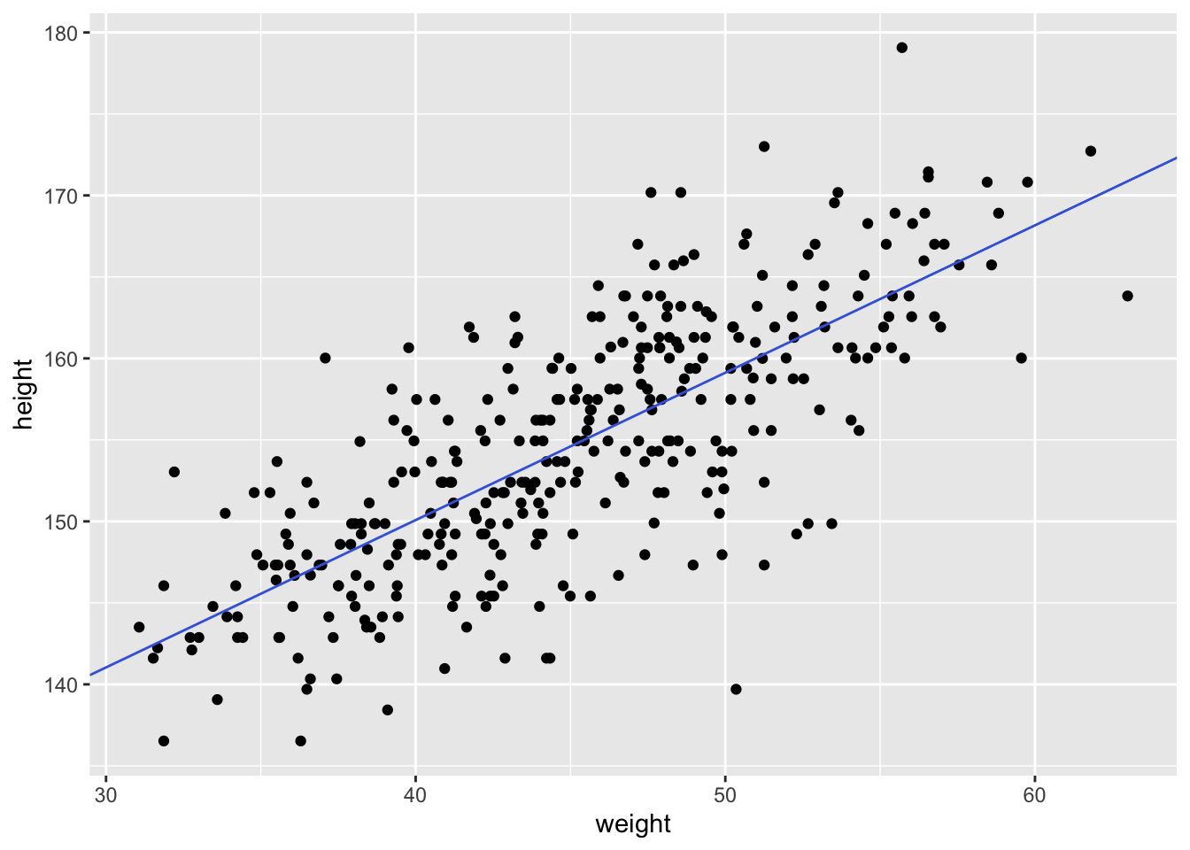
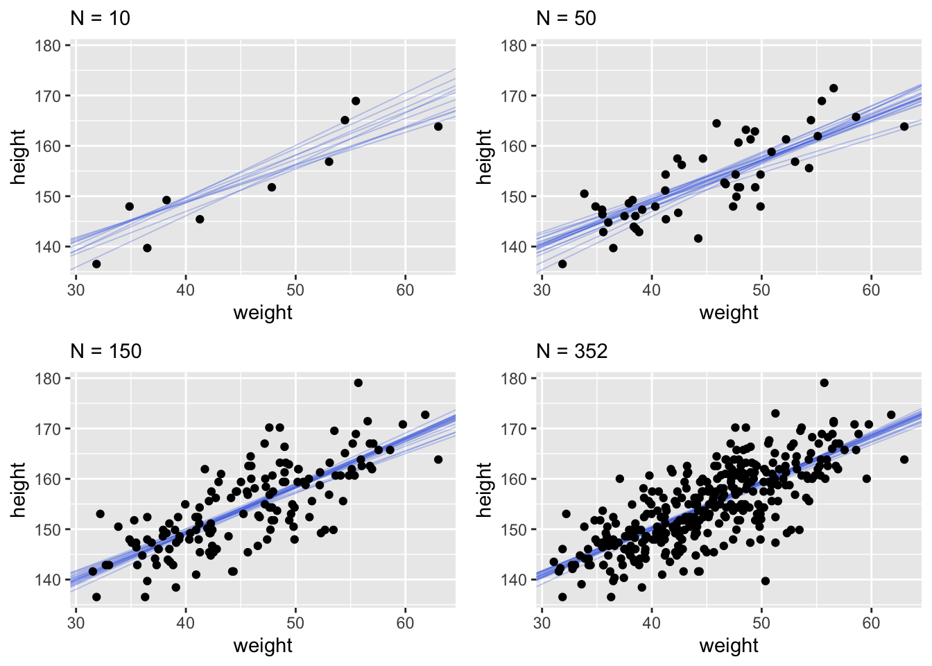
This quap line is just the most plausible line out of an infinite universe of lines the posterior distribution has considered. It’s useful for getting an impression of the magnitude of the estimated influence of a variable like weight on an outcome like height. But it does a poor job of communicatin uncertainty. Observer in the plots below how adding more data changes the scatter of the lines. As more data is added, our model becomes more confident about the location of the mean.
It’s important to remember that even bad models can have tight confidence intervals. It may help to think of regression lines as follows: Conditional on the assumption that height and weight are related by a straight line, then this is the most plausible line, and these are its plausible bounds.
Prediction intervals
Now we’ll walk through getting 89% prediction intervals for actual heights, not just the average height, \(\mu\). This means we’re going to need to incorporate \(\sigma\) and its uncertainties. Looking back at our statistical model \[h_{i} \sim \text{Normal}(\mu, \sigma)\] we see that our model expects observed heights to be distributed around \(\mu\), not right on top of it, and this spread is determined by \(\sigma\).
How to incorporate \(\sigma\)? Let’s start by simulating heights. For any unique weight value, we’re going to sample from a Gaussian distribution the correct mean height \(\mu\) for that weight, using the correct value of \(\sigma\) sampled from the same posterior distribution. Doing this for every weight value of interest gives you a collection of simulated heights that embody the uncertainty in the posterior as well as the uncertainty in the Gaussian likelihood.
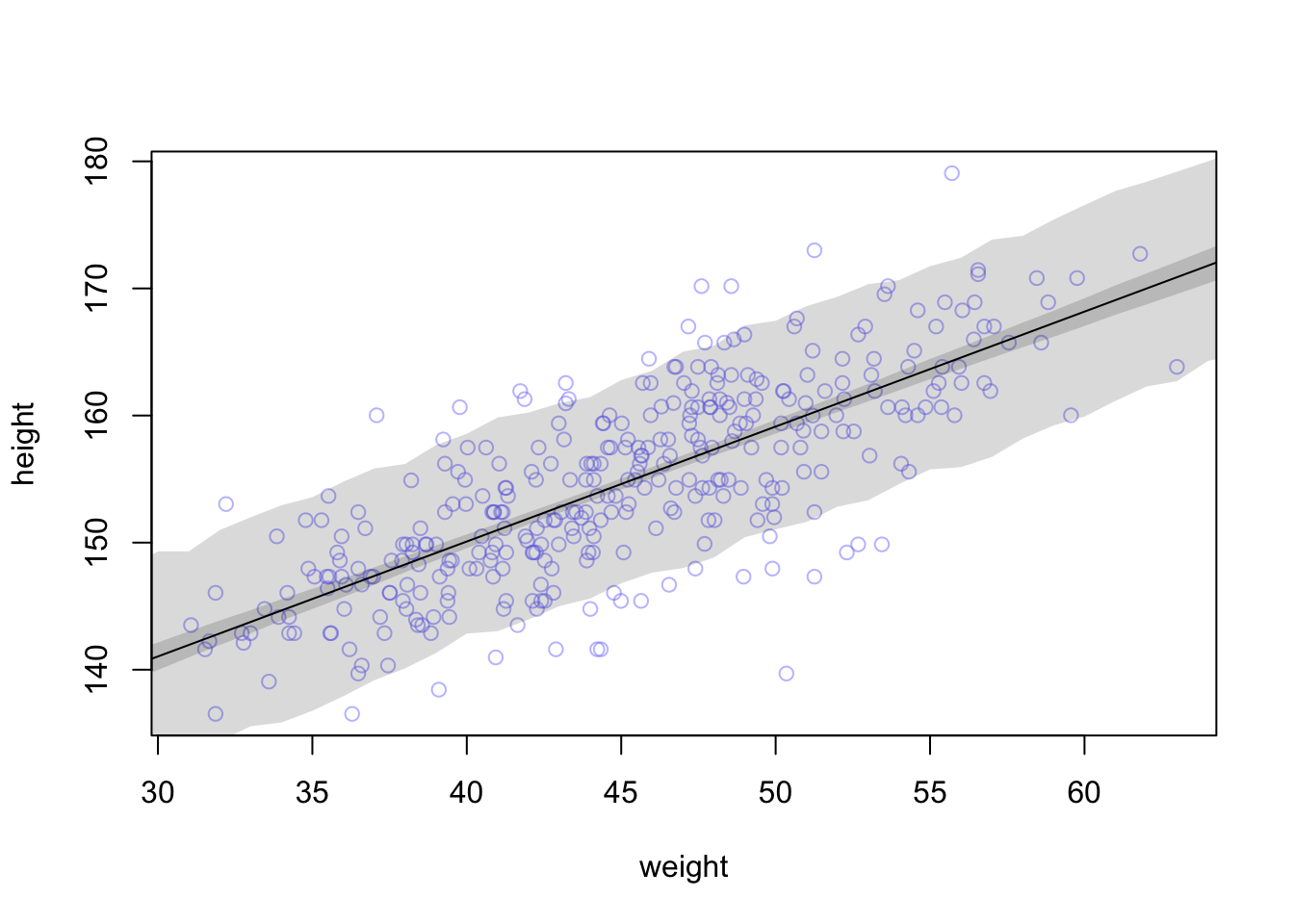
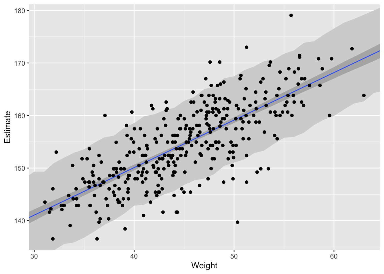
The wide shaded region in the figure represents the area within which the model expects to find 89% of actual heights in the population, at each weight.
Polynomial regression
The models so far assumed that a straight line describes the relationship, but there’s nothing special about straight lines.
data("Howell1")
d <- Howell1

d %>%
  ggplot(aes(x = weight, y = height)) +
  geom_point()
This relation is clearly curved. There are many ways to model a curved relation, here we’ll talk about polynomial regression. Before we continue it’s important to note, in general, polynomial regression is a bad thing to do. It’s hard to interpret. Nevertheless, we will work through an example, both because it’s very common and it will expose some general issues.
When we talk about polynomial regression, polynomial refers to the equation for \(\mu_{i}\), which can have additional terms with squares, cubes, and even higher powers. In this example, we’ll define \(\mu\) as follows: \[ \mu_{i} = \alpha + \beta_{1}x_{i} + \beta_{2}x_{i}^2 \]
The first thing we need to do to fit the model to the data is to standardize the predictor variable. We do this for two reasons: 1. Interpretation might be easier. For a standardized variable, a change of one unit is equivalent to a change of one standard deviation. 2. More importantly, when predictor variables have very large values, sometimes there are numerical glitches.
d$weight.s <- (d$weight - mean(d$weight))/sd(d$weight)

# No information has been lost in this procedure
d %>%
  ggplot(aes(x = weight.s, y = height)) +
  geom_point()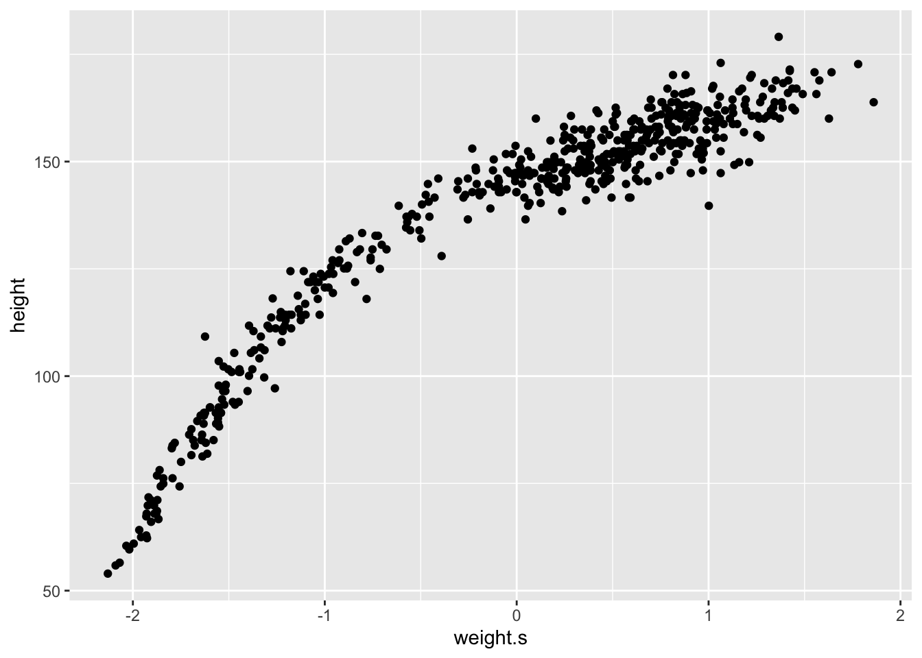
m <- quap(
  alist(
    height ~ dnorm(mu, sigma),
    mu <- alpha + beta_1*weight.s + beta_2*weight.s^2,
    alpha ~ dnorm(178, 100),
    beta_1 ~ dnorm(0, 10),
    beta_2 ~ dnorm(0, 10),
    sigma ~ dunif(0, 50)
  ), data = d)

precis(m)
## mean sd 5.5% 94.5%
## alpha 146.663371 0.3736588 146.066192 147.260550
## beta_1 21.400360 0.2898512 20.937122 21.863598
## beta_2 -8.415054 0.2813197 -8.864657 -7.965450
## sigma 5.749786 0.1743169 5.471194 6.028378Now we’ll look at a cubic regression. \[ \mu_{i} = \alpha + \beta_{1}x_{i} + \beta_{2}x_{i}^2 + \beta_{3}x_{i}^3 \]
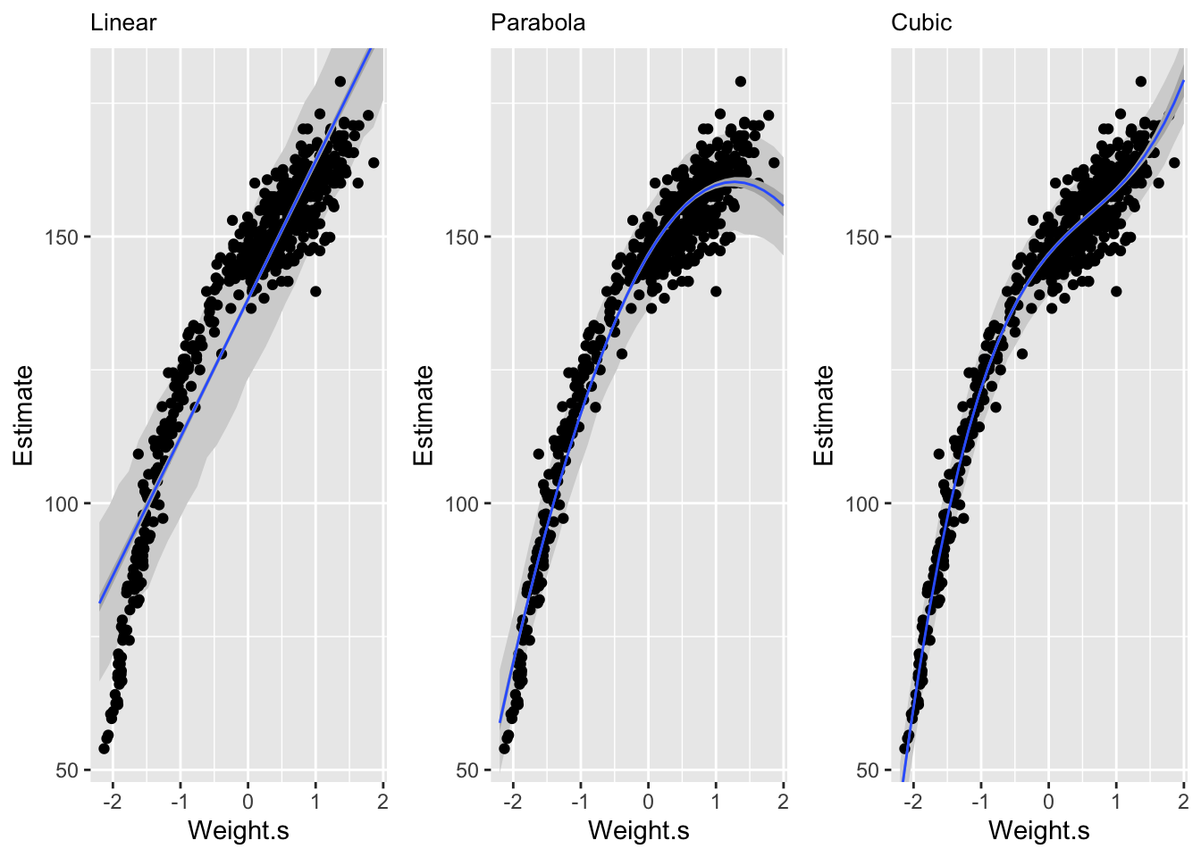
We can see here that the linear model is pretty poor at predicting given low and middle weights. The second order polynomial, or parabola, fits much better on the central part of the data in comparison. The third order polynomial, or cubic, fits the data even better. But a better fit doesn’t always constitue a better model.
Mitchell Joseph
Data Scientist
My research interests include survival analysis, bayesian statistics, statistical learning, and finance.